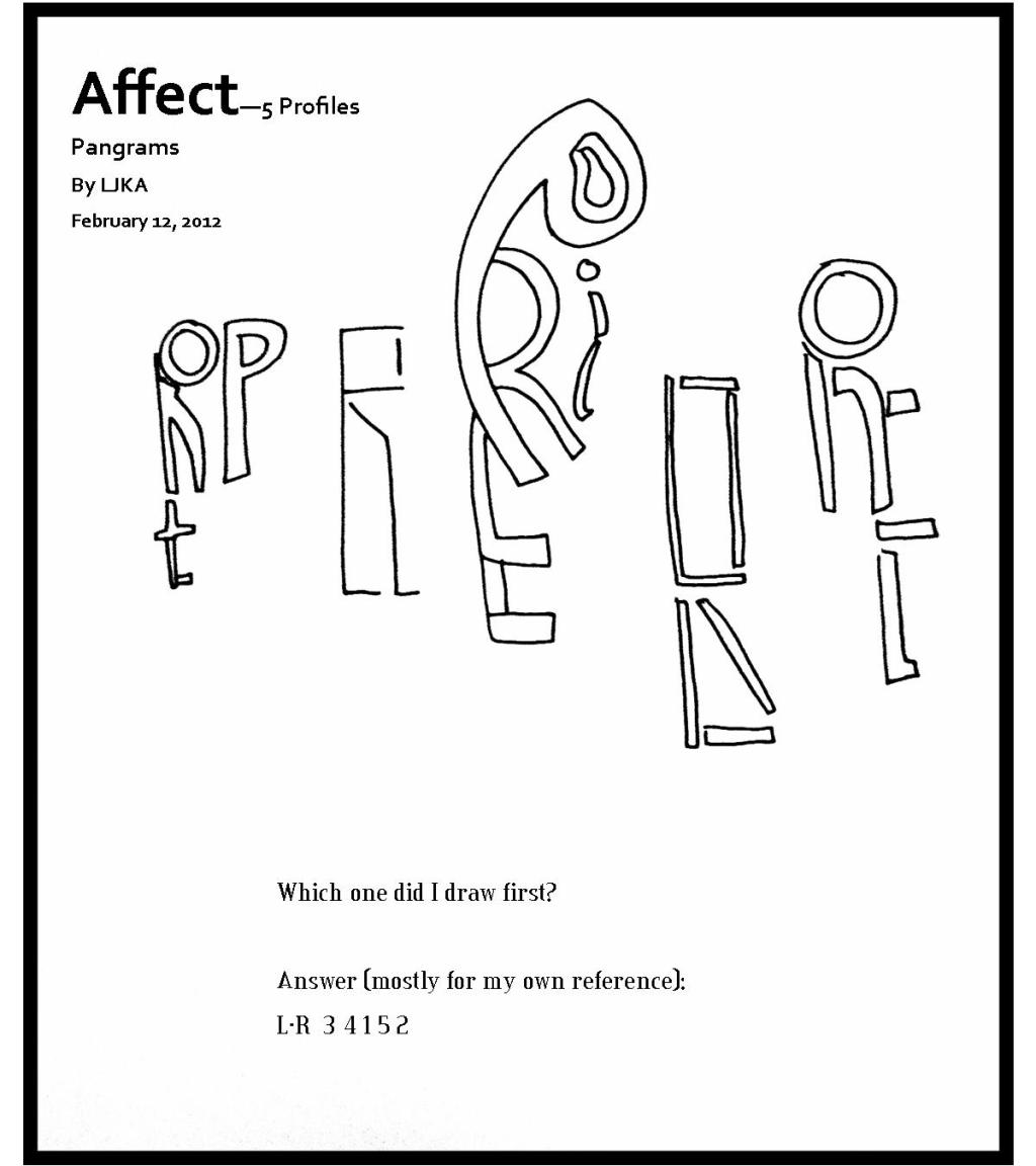
A lot of the letters in the word profile have similar shapes: long lines (l, f, p, E, i or I). The “o” was the only letter that seemed to be a trope [word use?] in the design. I suppose I could have drawn a lower case “e”. I just realized I didn’t try that once. Oh well. Also, I tried to make the word “profile” look like a profile. I hope that was obvious.
3 responses to “5 [Pangram] Profiles”
-
I wish I could anagram my response – it would read “loverly”
-
Also – I would watch out for autocorrect
-
are you referencing something I wrote or something you wrote?


What do you think?