Hot Mess Cafe

Written by:

I got some text down! This is more of (and literally) a yelp review than an autobio graphic cell (or whatever it is that I’m doing).  Thank you  Artznet, Michelle Kogan, and Exokotoks for your feedback regarding text boxes!

Here’s the text (full of links!):

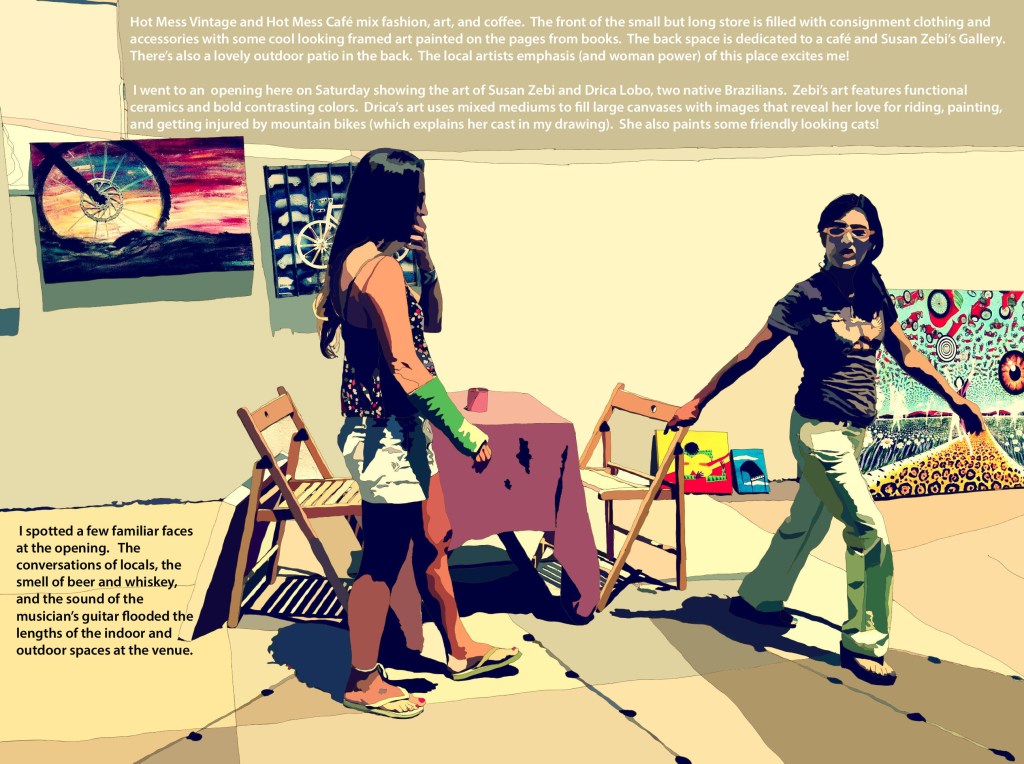
Hot Mess Vintage and Hot Mess Café mix fashion, art, and coffee.  The front of the small but long store is filled with consignment clothing and accessories with some cool looking framed art painted on the pages from books.  The back space is dedicated to a café and Susan Zebi’s Gallery.  There’s also a lovely outdoor patio in the back.  The local artists emphasis (and woman power) of this place excites me!

I went to an opening there on Saturday showing the art of Susan Zebi and Drica Lobo, two native Brazilians.  Zebi’s art features functional ceramics and bold contrasting colors.  Drica’s art uses mixed mediums to fill large canvases with images that reveal her love for riding, painting, and getting injured by mountain bikes (which explains her cast in my drawing).  She also paints some friendly looking cats!  I spotted a few familiar faces at the opening.   The conversations of locals, the smell of beer and whiskey, and the sound of the musician’s guitar flooded the lengths of the indoor and outdoor spaces at the venue.


I’m working on the text for this.  I’m not sure where to put the writing or how to size it.  I suppose I could just put a caption box at the bottom.  The artwork featured in the background is by the two women in the drawing. 

11 responses to “Hot Mess Cafe”

  1. exokotoks Avatar
    exokotoks

    where the text fits might depend on what it says – form and content stuff?

  2. lornayespeace Avatar
    lornayespeace

    brilliant!

  3. Michelle Kogan Illustration, Painting & Writing Avatar
    Michelle Kogan Illustration, Painting & Writing

    Hi Lorna, What about taking the image into Photoshop, or InDesign, you could make a text box and put the type anywhere you want to in either of these programs.

  4. artzent Avatar
    artzent

    In photoshop you could select the font and write directly on the image without using a text box. You can also control the color of the text contrasting with the image so that It can be easily read. You will find the answer but getting input from others is helpful

  5. Sally Haig Avatar
    Sally Haig

    Thanks for visiting my blog. I am a little low on the learning curve here at wordpress…pardon the slow response. I am more of an analog artist so I can’t help you out much here but I LIKE your work!

  6. lornayespeace Avatar
    lornayespeace

    I appreciate the analog! I’m trying to figure out the balance between analog and digital myself.

  7. exokotoks Avatar
    exokotoks

    i like the spacing here. On my screen, the white type was a little difficult to read, although that may have been just in contrast to the sand background. i do like the movement of the piece.

  8. lornayespeace Avatar
    lornayespeace

    Thanks! I think the text is a bit too small, too! I can fix it!

  9. MissJiki Avatar
    MissJiki

    Hi Lorna, I think your work is great! I admire that you’ve created a conversation on your blog and you’re getting lots of fantastic feedback. I find it really inspirational. I like the candidness of this piece and the colors.

  10. lornayespeace Avatar
    lornayespeace

    Thank you! I’m so happy that you like it!

  11. Lobster McGee Avatar
    Lobster McGee

    That bottom one showing the process!! Rad

What do you think?