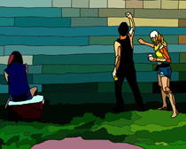
When we pressed the chalk hard enough onto the wall, it became more opaque than we were. We felt light and transparent, transformed into friendly ghosts who haunt the Plaster of Paris creations until it rains.
I had some difficulty making final decisions with this image. I wanted to play with transparency, but I also wanted to use color to emphasize the chalk wall. The transparent people sort of turned everything a bit too pastel for my liking. There might be too much going on. If I wasn’t so attached to the original composition of the image, I would have rearranged the people (places and things). Instead, I’ve only worked with the colors, opacity, and brightness/contrast/saturation levels (in addition to line width and details in the drawing). All the layers together convoluted the image. Something is lost. Perhaps it’s best for me to experiment on drawings with simpler lines so I can figure out techniques instead of surprising myself all the time. I need to focus on the subject. I need to decide on the subject. The typography sort of looks more haphazard than I would like, as well. Maybe a series of three images would allow me to show the layers of transparency and create a ghostly effect without coming off as overwhelming. WHICH IS YOUR FAVORITE?
1.

2.

3.

4.
 5.
5.

6.

7.

8.
![]()
9.


What do you think?