I joined the Art House Co-op Map Project, and made this map/self portrait. I made my own map based on one I created through esri that organized the 90026 zip code according to unemployment demographics. I’ll take you through the process:
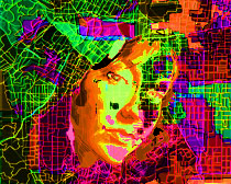
This is the final 20″x30″ digital drawing. I wanted to integrate the face into the map, but the portrait may be too obvious here. I played around with brightness/contrast and hue/saturation in order to add some depth and enhance the colors. I also varied the lines’ opacity and color.

This is the map without the portrait.

I spent a lot of time on different layers of lines.

My map:

Fewer lines:

The portrait without some of the color adjustments that made it to the final image.
 The lines of the portrait. I thought about just using these lines to make the map.

The map I made on esri:
 I doctored the above map with the outline tool on Illustrator. I used the resulting simplified map (below) as a template. This process helped me develop my map because it clarified the main shapes. The above map by itself was too intimidating to start drawing (though I eventually worked up to it).

And the photo the portrait is based on. Again, I’m embarrassed. 


What do you think?