I spent the 4th of July in a pool with a slide that looked over the city of Burbank. Not too shabby. This is the same spot as my Flip Over Burbank drawing. I am enjoying editing photos, though I’m not quite sure when to stop. I keep going back and forth between layers of filters, thinking to myself, “Which of these looks cooler?”
It’s easier to decide on a final image when I have a purpose or story to tell. If I have something I’m going for, perhaps a point of view as an artist, I[‘ll] have a better idea of when I’ve reached it.
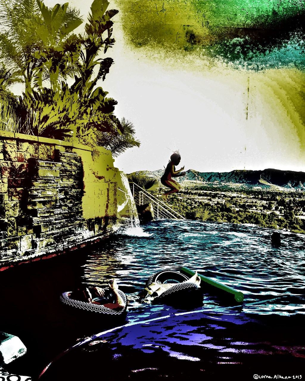
I finally had the foresight to save images of the process of this piece. I’ll take you through a few. I’m interested to see if you agree with my final decision.
Here is the final 16″x20″
I like the dreary colors for such an otherwise cheery image. Maybe things are not as they appear. I feel a sense of impending change with this image. [and some people on instagram validated my choice. who am i arting for?]

I don’t like all the yellow in this version. It takes away from how pretty the colors of the pool are, and the details in the background get a bit lost. Too much going on it seems.

This is how I edited the photo initially. It’s not too different from the unedited photo. It’s just a bit brighter and clearer. It’s not as interesting or ominous as the final version.

Also, if you like my stuff, give me a “Like” on Facebook. It’ll be fun!


What do you think?